Tuesday, December 19, 2017

Processing UAS Data with GCP's

Introduction:
This project introduces the user to manually tying Ground Control Points (GCP's) to UAS imagery in Pix4D.  It is virtually the same as the previous 'Processing Data with Pix4D' lab with the exception of manually adding ground control points.  The ground control points in this lab were physically placed at the site of the imagery before it was flown.  These ground control points were then recorded by using survey grade GPS units.  This location information of the GCP's will be used to tie the imagery down to the real world.  The last lab had issues with the images not having the correct elevation.  Hopefully, adding the GCP information to the images will solve this issue. 

Methods:
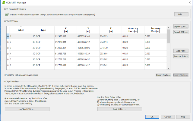
The method to add pictures and process them is the same process as the 'Processing Data with Pix4D' lab except for one step before the processing is actually started.  When the user gets to the main Pix4D screen, they want to go to Project - GCP/MTP Manager- and import their GCP coordinates from a text file.  This text file contains location, elevation, and accuracy information about the GCP's.


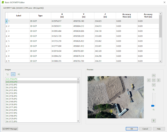
 The next step is to run the initial processing.  After that is complete the it time to manually edit the GCP's to tie them to each individual image.  This can be done by clicking basic editor.  The user will then click on a GCP from the list and a list of images that are near that point will pop up.  The user will then click on a image and select the center of the GCP, it is important that they are marking the correct GCP.  This is why field notes were taken and the number of the GCP was painted next to it to make sure it could be seen in the imagery.  This is done for 5-10 GCP's in the data set and the program will automatically tie the rest down.


When the user finishes tying GCP's to images, it is time to reoptimize.  This ties the images down to the GCP's in the system.  The next step is to use the Ray Cloud editor to hone in the rest of the GCP's.  In the Ray Cloud editor, the user clicks on the GCP in the layer list (on the left in the image below) and then looks to the images in the bottom right corner.  This shows all the images with that GCP.  The user should then put the mark in the center of the GCP for a few images and it apply to make sure the rest of the images for that GCP adjust, if they do not, continue to put them in the center until all the images line up.  This should be done for all of the GCP's.  Once this is done the user should re-optimize one last time.


  If the re-optimization is done and the GCP's are all marked it is time to run the rest of the processing to get a point cloud and a DSM.  This is done the same was as it was done in the last lab. 

GCP's and Data Quality:
In the previous lab, the same imagery was processed without using GCP's.  This resulted in bad data that could not be used.  Pix4D automatically generates GCP's from the image data to tie the images to a location on earth.  To the untrained professional this may be enough.  Manually placing GCP's at a project site and taking their location with a highly accurate GPS allows for the user to input these into Pix4D and tie them to the imagery.  This creates maps that are highly accurate and spatially tied to the real world.  Highly accurate imagery and maps is highly valuable in many situations.

Maps:


The resulting map is the exact same as when processing it without adding GCP's.  The real benefit is with the spatial accuracy of the files.  This can be seen in the elevation data of the DSM in the map above.  The elevation values in this map are around 225m above sea level to around 254m above sea level.  This is the correct elevation for this area.  This fixed the elevation issue that occurred when processing the data with no GCP's.   


Conclusions:
In order to get highly accurate positional data from UAS data, GCP's must be incorporated especially if a local datum is not available.  If taking flights in a remote country or location GCP's may be the only option to tying the images to the earth.  The use of GCP's create more accurate data that is highly beneficial to the user in the long run. This data is spatially correct and can be used for volumetrics of piles in the mine.  Volumetrics can be done using ArcMap and if done correctly can get as accurate, if not more accurate numbers than using a total station or doing it the traditional way of climbing piles and measuring.  GCP's are extremely important for accurate data and should be used every time a site is flown.  This ensures accurate data and accurate data is vital for good analysis. 

Wednesday, December 6, 2017

Processing Imagery in Pix4D

Overview of Pix4d:
Pix4d is an image processing software that is based on automatically finding thousands of common points between images.  When the same common points (keypoints) are found on multiple images the, program generates a 3D point.  In order to create highly accurate 3D images, images must maintain high amounts of overlap to create as many 3D points as possible. It is recommended by Pix4d that at least 75% frontal and 60% side overlap is maintained.
Pix4dmapper 3.1 Usermanual 
When mapping terrain such as forest and dense vegetation, flat terrain with agriculture fields, and areas of snow and sand a minimum of 85% frontal and 70% side overlap is recommended for quality map construction in Pix4d.  In many cases camera settings, such as exposure, must be adjusted to receive quality images.  Pix4d can process multiple flights by overlapping images from both flights.  Both flights must be taken at a similar altitude.  Pix4d can also process oblique images.  For the user to get high quality maps from oblique images, the user must take images with their camera at multiple different angles.  Pix4d does not require Ground Control points to create accurate georeferenced maps.  The program will automatically do this with the coordinates that are tied to the images.  It is recommended that GCP's are taken of the study area and put into Pix4d to create the most accurate map possible but is not required.  If the pilot is conducting multiple flights of the area it is important that they are maintaining the same height and overlap for each flight.  This will ensure the best possible data.  After inputting and processing the images a quality report is created that includes details about the processing such as, summaries, quality checks, calibrations, maps, and information of the data. 

How to Use the Software:

To begin processing in Pix4d the user must connect the program to where they want to save and what to call the new project.


The user must then import their images


Once the images are imported into the user must confirm or change,  image coordinate system, geolocation and camera settings. Camera setting are important to have right to allow for proper image processing.


In this case the camera shutter model was set to a Global Default and was changed to a Linear Rolling Shutter. 


The next step is to confirm the output coordinate system and GCP coordinate system and select the type of processing that needs to be done.  In this case we selected for Pix4d to create 3D Maps. 


When finished inputting the data the user gets to a screen that allows them to start the processing.  The user then sets his processing options and selects to only do the initial process.  If the user leaves, Initial Processing, Point Cloud and Mesh, and DMS, Orthomosaic and Index selected it will process all three parts while doing an initial process for each part.  This wastes time so it is advised to run the initial process, then run #2 and #3 together.
After processing the user will get reports for each process as well as the map.  All the user needs to do to view the map is turn cameras off in the layers section and turn on triangle meshes.  This will result in a map similar to below.


Maps/Data:

After the processing, Pix4d creates a report with lots of useful information.  The first page of the quality reports shows a summary, quality check of processing results, and a preview of the maps that are created.


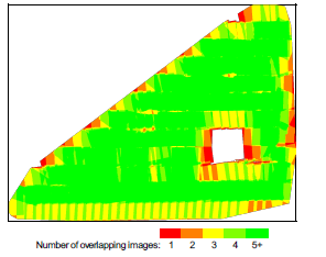
 In the report is a section about overlap.  It is important that the images contained a high amount of overlap to create as many keypoints as possible.  This will ensure the highest quality 3d image. It can be seen that there are areas of the map that have poor overlap.  This could be due to a gust of wind pushing the UAS slightly off its path or the sensor not identifying what is below.  The patch in the middle that in missing is actually dense forest that the sensor could not correctly pick up on.  The processing only used 197 out of 222 images.  This is because it deemed that 25 images could not be tied into the rest and discarded them.  This is most likely the area that was left out and some images on the edges.


The .tif files created in Pix4d can be imported into a geodatabase in ArcMap and created into visually appealing maps.  The map below is a Digital Surface model and a mosaicked image of the mine the data was taken from.  The map on the right shows the height of different objects in a color scale model and the map on the left shows the visible band image of the area.

Unfortunately the data taken from this lab was incorrect.  There was an issue with the camera and how it tied in elevation data to the images.  When using the identify tool in ArcMap it says that the elevation is around 100m above mean sea level. In reality the elevation if this area is more in the area of 220+m above sea level.  This is a severe mistake in the data means this data cannot be used. 


This issue of incorrect elevation will be solved in the next lab, processing data in Pix4D with GCP's. 


First Impressions of Pix4d:
At first impression this software is easy to use and can be very beneficial for many applications in the UAS world.  Taking drone imagery then turning it into a georeferenced 3D map without Pix4d would require extensive knowledge of different programs and algorithms.  Pix4d allows for a user to quickly create high quality 3D maps in  a short period of time.  To create an image that is more spatially accurate Ground Control Points should have been manually put in and taken of the area then tied to the imagery.  Pix4d automatically creats GCP's from the locations on the images but this is not completely accurate.  This first look at Pix4d was a great introduction to 3D mapping from UAS data.  There is much more to learn about image processing in Pix4d.


Conclusions:
Overall, Pix4d is a very useful tool in importing and processing large amounts of images from a UAS platform.  It streamlines the workflow allowing the user more time for analyzing the data to gain contextual insight and less time processing and creating maps and images.  Mistakes can be made using this software so users must take caution.  A person who does not know a lot about mapping and datums and lacks GIS experience could have taken this data set and used in for pile volumetrics.  This would have led to severely wrong numbers that would lead to an expensive lawsuit. 

Tuesday, December 5, 2017

Visualizing Sandbox Survey

Introduction:

Earlier in the semester, a survey was done on a sandbox to get information about elevation (See Lab 1) .  This lab will use this data to visualize what the sandbox actually looks like.  Before any data can be used, it needs to be normalized into a fashion that can be used in ArcMap. Data normalization is putting data into a generally accepted format.  There were many ways to collect the sandbox elevations and if they are not normalized into the proper format, ArcMap will not accept or understand them.  In ArcMap this format consists of an X location column, a Y location column, and a Z value column.  This will then allow the user to input the XY data as spatial points.  In our lab, we took a z value for every 6 cm in the x and y direction.  When these points are put into ArcMap, it will create a grid with points every 6 cm.  Each of these points will have a z value associated with it, the computer will then need to fill in the gaps between the points.  In order to do this a few different methods will be used, IDW, Natural Neighbors, Kriging, Spline, and TIN.  A description of each method will be given in the methods section.

Methods:

Fortunately we collected the data in a matter that required no data normalization.  It was already formatted properly and ready to get imported into ArcMap.
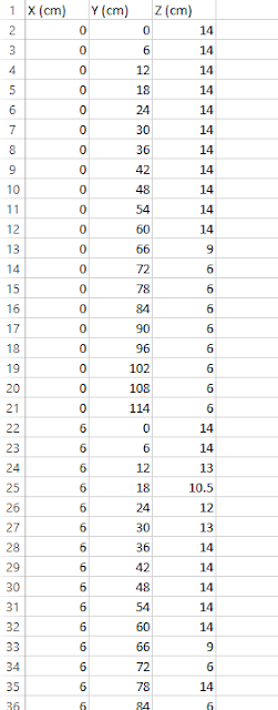
Figure 1: Excel Sheet

The next step was to import the tabular data into ArcMap.  This was done by using the Add XY Data tool.  This feature was then exported into a geodatabase and saved with the proper name.  This data was given no coordinate system because it has no coordinate system.  A 114 cm x 114 cm sandbox is being mapped, this grid is its own "coordinate system" (figure 2).  This data is now ready to be used to create elevation models.
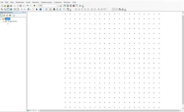
Figure 2: Data Points 
To do each of these interpolation methods, a their respective 3d analyst tool was ran with the data points class as their input.  This was the same process for all the methods except when creating a TIN.

 The first method used is IDW or inverse distance weighted interpolation.  IDW makes that assumption that points that are closer together are more alike than those that are farther apart.

The next method that will be used in natural neighbors.  Natural neighbor only uses the points near it to determine how the area should look.  It does not infer trends and will not create peaks, valleys or ridges.

The next method that will be used in natural neighbors.  Natural neighbor only uses the points near it to determine how the area should look.  It does not infer trends and will not create peaks, valleys or ridges.

The next method used was the kriging method.  This method uses a statistical equation to determine the shape of the area.  It uses a formula based on the whole data set and points near each other to determine the overall shape.  Unlike IDW and spline, the kriging method actually uses math to predict what the surface will look like.

The next method that was used is the spline interpolation method. The spline method creates a surface with the smallest amount of curvature possible.  It like taking a sheet of rubber and bending it touch a bunch of points.

The final method used is a TIN or triangular irregular networks.  Unlike the other methods, a TIN is a vector data set where as the other methods create raster images.  A TIN basically takes each point and connects them using a flat surface.  This results in a clunky non flowing model.

Once a raster was created for all the methods (except TIN), the hill shade tool was ran to create a hillshade for each of the rasters.  The hillshade was then overlaid on the raster and given 30% transparency to give the image more depth.  This can be seen in the top image of all the maps below.

Finally a 2D scene was made for each of the interpolation methods.  This was done by bringing in the raster to ArcScene and setting the elevation from surfaces to floating on a custom surface.  This gave the image a 3D appearance by using the surface created in ArcMap.
Figure 3: Elevation from surfaces

This scene was then given the proper symbology and exported as a jpeg.  This image was brought into ArcMap and put onto the same page as the raster and hillshade.  Finally, this map page was exported and brought into Adobe Illustrator to be given a scale.  A scale needed to be manually put in because the data was not in a coordinate system.


Results: 

The IDW method created a raster with visible "bumps" where each of the points were.  It did not create a seamless surface.  The IDW method was not really the right method in this situation because it weights points that are closer together heaver than other points but in this lab all the points are equidistant from each other. 
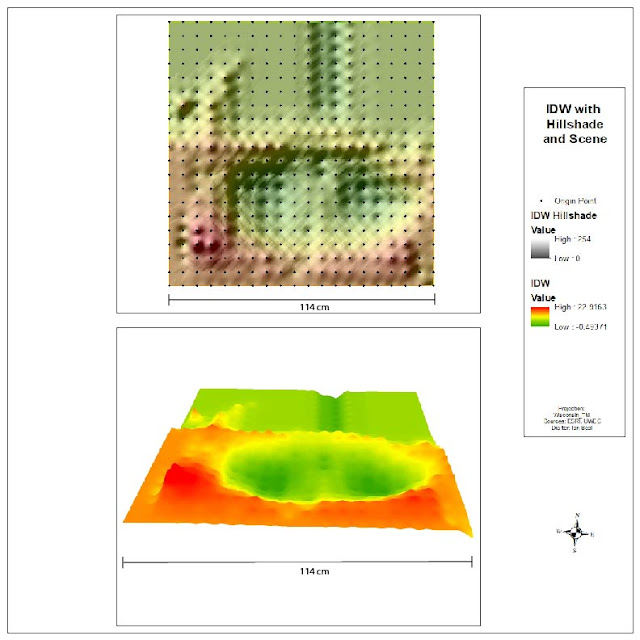
Figure 4: IDW

The natural neighbors method did a pretty good job of recreating the sandbox.  None of the points are too harsh and none of the valley and ridges are over defined.  Since natural neighbors only uses the points near it, it properly created all the peaks and valleys that were really in the sandbox.  There are a few sections where it looks like natural neighbors created dimples in the surface. 
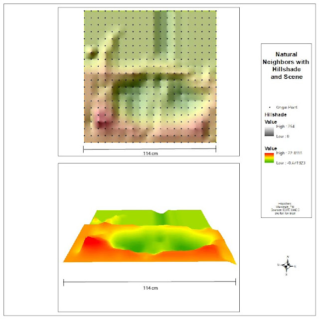
Figure 5: Natural Neighbors
The kriging method did a pretty good job but almost lacked some definition.  It is a good representation of the sandbox but seems like it is flattened out a bit.  Since the kriging method uses a  statistical equation to fill in the gaps, it appeared to have flattened out the peaks and ridges on the map.  Since there is a large flat plain in the northern edge of the sandbox, the equation must have thought the sandbox was flatter than it actually was. 
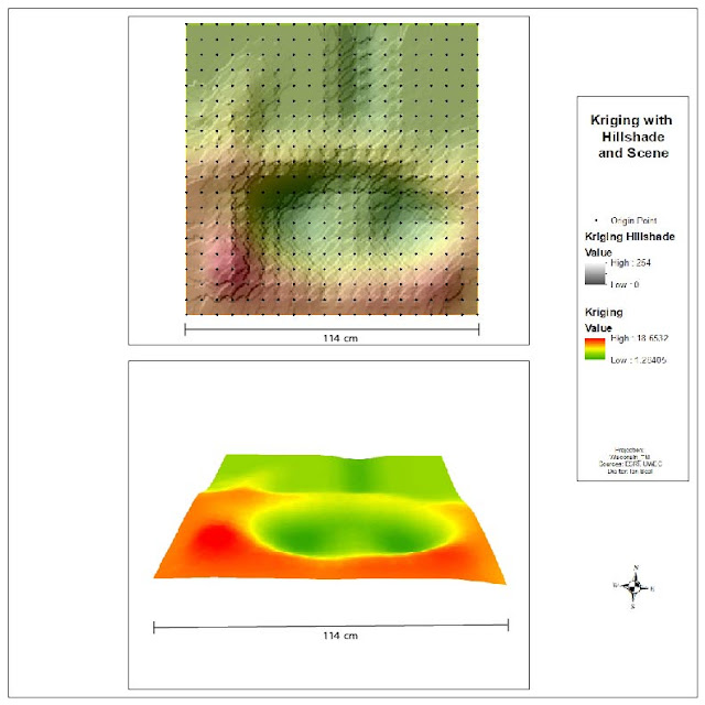
Figure 6: Kriging
The spline method did a very good job of recreating the sandbox surface.  The hills, peaks, valley and ridges are pretty much what it looked like in real life.  The spline method is like taking a sheet of rubber and bending it to touch all the points.  Since we were working with sand and did not create any sharp edges, this method ended up creating the most realistic surface model.
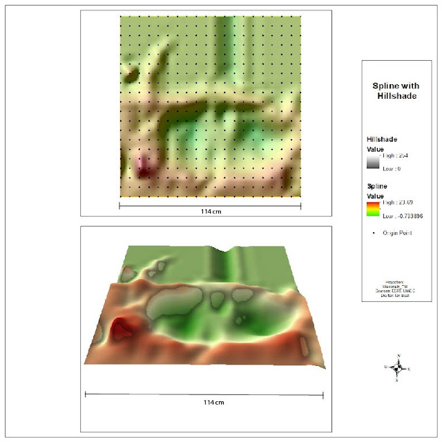
Figure 7: Spline

Finally the tin is what can be expected from a TIN.  It got all the points right but fails to fill in the gaps with a curved surface.  A TIN only uses flat vectors and gives a choppy appearance. 
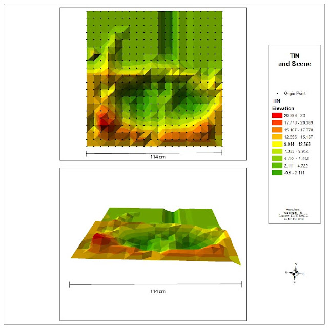
Figure 8: TIN
Conclusion:

Of all the methods the spline method created the most realistic surface model.  The 2D surface model created in ArcScene almost looks like a sheet of plastic was draped over the sandbox.  The spline method did such a good job because the sandbox had no sharp corners or big steep drop offs.  If there was a sheer wall or cliff in the sandbox, the spline method would have curved that surface.  Since we did not include any surface like this the spline method did a good job.  The natural neighbor method did the second best job.  It looks similar to what our sandbox actually looked like with the exception of  creating slightly less steep slopes and having a few dimples.  Each of the methods used above has its advantages and disadvantages for each situation.  They are all powerful but need to be used in the right application.  In this situation the spline method ended up being the best method.


Tuesday, November 28, 2017

Collector Project

Introduction:

Data is the lifeblood behind GIS that makes it such a powerful tool.  ESRI has created the Collector application that makes it very easy to collect data that can be used to further analysis.  The objective of this lab is to ask a question and answer it using data that is collected using the collector application.

College students who have lived off campus for a few years often get accustomed to the uncleanliness of their fellow students.  Whether it be in the house or out, it is well known that college students are not the most tidy people in the world.  One thing they often do is throw trash in people yards, or their own, and fail to pick it up in a timely fashion, if not ever.  Is there a pattern to trash in college students yards?  Do houses nearer to water street have more garbage in them than houses farther away?  This seemed like a question that could be easily answered with some data collected using the Collector Application!

Methods:

This study was to take place on and near water street in downtown Eau Claire Wisconsin.  Before any data collection could take place an empty feature class was created, the proper fields were added, and a proper symbology was given to the feature.  This feature was then published to the University of Wisconsin Eau Claire Organization ArcGIS Online account.  Once it was published, a webmap was created to host this data.  This webmap can now be accessed from the collector app and used to collect data.  The first step to collecting data was to decide where to collect data.  To thoroughly answer this question, data was collected on the amount of garbage in yards on water street, and the next three streets that parallel water street, Chippewa Street, Niagara Street, and Broadway Street.  This data will provide some detail to whether or not garbage in yards has to do with being on water street.   The fields used to in this data were, Street Address, Amount of garbage, Whether a majority of the garbage was in the front of back yard (Street of Alley side), and additional comments.  With everything set to go, it was time to collect data.

The data was collected by walking in the alley behind the houses and counting garbage then walking on the street side of the house and counting garbage and collecting the data on collector.  The address of the house was recorded, the amount of garbage was recorded, whether there was more garbage in the front or back of the house was recorded and any other additional comments were recorded. This was done for water street and the next three streets that parallel it.

Results:

The resulting data is very interesting yet not surprising. There was by far more trash on houses that were on water street than on the other streets.  The map below shows the numbers for how much trash was in each yard.


One of the Water Street yards had thirty pieces of trash in the yard!


If you look closely, almost 15 pieces of garbage can be seen in this picture of the yard.  There was even more in other places in the yard.

The following map shows the amount of garbage with labels for the addresses.  The house with the most amount of garbage was 609 Water Street.

The final map shows whether or not there was more trash in the front or back yard.  This is important because it helps answer the question if it's residents or just passerby's who do the littering.

The data from front or back shows that a majority of trash in people yards is in the front yard, next to the sidewalk.  This is especially true for the houses on water street.  The following link is to the webmap used to collect the data. 


Conclusions:

It can be concluded that there is more trash in people yards nearer to water street.  More data would need to be collected to conclude whether or not distance to water street affects the amount of trash in peoples yards but it can be seen that being located directly on water street leads to more trash accumulating in peoples yards.  This could be because of the higher amount of foot traffic or more people littering out of there car.  When the data was actually being collected, by the time data was collected on water street, then all the other streets, there was actually a brand new empty chip bag in on of the water street yards.  This helps reinforce that the littering might being committed by the cars passing by.  This along with a higher amount of drunk hooligans that pass by on a regular basis leads to more garbage being present in water street houses.  

Tuesday, November 14, 2017

Priory Navigation Activity

Introduction: 

Field navigation skills are very important skills that are required to be an effective geographer in the field.  If there is data to be observed and collected in the field, there is a chance that it may be remotely located.  Driving straight to a point of interest is not always how it works, being able to navigate in the field is an essential skill.  In this lab, the class was to put their navigation skills to the test by finding points in the woods that were placed by Dr. Hupy.  The class was to use GPS and a map to locate the points, then go back out using just a compass and a map.

Methods:

The class met at the Priory on a dreary Saturday the first weekend of November to do some field navigation.  The Priory is located just south of highway 94 on the south side of Eau Claire.  It is a heavily wooded piece of land owned by the University that is ideal for learning how to navigate in the field.  When people started to arrive, they broke off into their groups and plotted their points on the print out maps that were given to them.  These points were plotted using using coordinates for the GPS activity and the UTM grid for the compass activity.  Each group was given five points on a course to plot.  Once the points were plotted, GPS units were handed out and the groups connected their GPS to their IOS devices and BadElf app.  The BadElf app had to be set to UTM to be the same as the map.  Once this was done, groups were ready to go out into the field and find the points.  The group first decided to go to a known point that was near where the first point was.  This was at the corner of the building near the woods, the group then entered the woods walking to where the first point was.  Once near the point, the GPS was used to find the current location, this location was then used to reference what direction the point was in, the compass was then used to head the appropriate direction.  This was the method used to find all points in the course with a GPS.
Floppy Wet Map

Brian with a Point

Mark with a Point

Me with a Point

Anna with a Point

After the group found all the points, the class reconvened to prepare for the compass navigation.  To prepare, the points had to be plotted on the map with the grid. The points were then connected using a straight edge.  The next step was to get the bearing from one point to the next, for this, the map was orientated so that north was north and the compass was placed on the map and also orientated north.  the direction the line was going was the bearing that should be walked from point to point.  This number was written down for each line. Before the group began to find the points with a compass, a known location was picked out (corner or building) and a bearing was found, this is how the compass activity was started.
Finding a bearing on the map 
As well as finding the points with a compass, the distance between the points was also found during this activity.  To do this, a 100 meter pace count was found and recorded (62 paces per 50m for the group) .  These numbers were recorded and used to calculate the distance between the points.

Results:

Our group got off to a rocky start,  we were looking for the first point when a bowhunter came up to us and told us we were on private property,  we believe the property lines may have changed and one of our points was on the part that was no longer the Universities, or the hunter was trespassing.  After this dilemma, our group successfully navigated to the remaining 4 points in our course.  The following image is the  coordinates given by our professor (top) and the coordinates of the points taken from the GPS when our group found them.
Given and Actual Coordinates

The following map shows the track log from the GPS activity.  The area in the bottom left is when our group was looking for the 5th point and ran into the hunter, we then went around by the building and fount the rest of our points.


GPS Route
The following map shows the route when finding the points with a compass.  This shows that the track goes much more directly towards each point.  Our group found it much easier to use a compass and bearing to find a point.  We doubted the method at first, but when we walked straight into our points, we were thrilled!

Compass Route
The following map shows the two routes together.  It can been seen that the blue route (GPS) involves much more wandering to find each point.  We often veered in the wrong direction for a while before we realized it.
Combined Routes
Conclusion:

This lab was great for learning how to navigate the woods.  I have personally been hunting since I was 12 and have spent lots of time in the woods, but this lab taught me a lot about navigating.  I enjoyed the compass method but felt that it will only work if navigating a small area.  Traveling a slightly wrong bearing for a small distance is not a big deal but if trying to navigate a long distance by a bearing, being off a small amount can make you completely miss the target.  If you are trying to navigate a large expanse of woods and get lost using the compass method, it will be very hard to get back on track.  The GPS method of navigation might not be quite as efficient, but is much more effective in the long run.  I think a combination of the two would be the most effective on finding points.


Tuesday, October 31, 2017

ArcGIS Collector

Goal and Background:
This lab was designed to introduce ESRI ArcCollector as a tool for collecting data in the field.  ArcCollector is an application that can be downloaded onto any apple or android device and used to  collect spatial data.  The application is set up in a mapping interface that allows the user to drop a point and fill out information.  In this lab, a microclimate survey was conducted by the class of the University of Wisconsin-Eau Claire and the surrounding area.  ArcCollector allows the class to simultaneously collect data points and add them to a map in real time.  Each group is able to collect information about the climate at different parts on campus, and update points on a map in real time.  This map can be viewed on a computer or phone and the progress of the data collection can be monitored.

Methods:

The first step to creating a collector map is to create an online map that has an empty feature class to be populated by people in the field.  This feature is given fields that are to be filled out by people in the field.  This was all done by Professor Hupy in this lab.  This lab began with down loading the ArcCollector app and signing into the UWEC Enterprise ArcGIS online account.  On a computer, a request was sent to be part of our class group on ArcGIS online.  Being a member of the group allowed users to have access to maps that were shared to that group.  Once a member of the Field Methods group and the app was opened on a phone, the user simply opened the map on collector and they were ready to add data!  The class was separated into groups of two and sent around campus to collect weather information.  The following list are the fields each group filled in when taking a data point:

-Temperature
-Wind Chill
-Dew Point
-Wind Speed
-Wind Direction
-Group Number
-Notes
-Time

To get this data a hand held "weather station" was used, this provided all the necessary data.  To data a data point, the "plus" icon in the app in selected and it prompts the user to enter the above data.  Each of the fields is filled out and when submit is selected, the app drops a point from the phone's gps with the data that was entered!  Each group was sent out for over an hour to collect as many points as they could.

Once back in the lab, the data collected in the field was downloaded onto a local drive off the internet by downloading the feature layer from ArcGIS online. This was simply done by finding the right layer that was created by Professor Hupy, and clicking it.  This opens a page that allows the user to open the feature in ArcMap Desktop.  The following image is a screenshot of the screen that allows the user to open the feature in desktop. (figure 1)

Figure 1


This opens ArcMap with the point feature open as a feature layer.  This data is not ready to be manipulated.  The actual point layer then needs to be exported as a feature class into the appropriate geodatabase.  Now the point feature is in a local drive and ready to be made into a high quality map.  The next step in this lab was to use this data to create maps.

Results:

A map with just the points where data was collected would not be very useful.  The true power to the data that was collected lies within its attributes.  The first map created is a map that symbolizes wind speed and direction.  The size of the arrow represents the speed of the wind and the direction of the arrow represents the direction the wind was coming from in that specific location.  It is very interesting to see how elevation, buildings, woods, and other elements affect wind speed and direction

Figure 2
 The next map is a map of a temperature raster overlaid on a topographic base map.  The temperature raster was created by using  a tool in ArcMap with the temperature data the class collected.  This build an image that shows where the hot and cold spots are located on campus.  If one if familiar with the Eau Claire campus, they know that lower campus sits between a large hill and the Chippewa River.  In late afternoon when this data was collected, 3-5 pm, the location of the sun meant the hill and other buildings were casting large shadows, making the temperature reading lower in many area of campus.  This can be seen in the map below, the center of the map has many areas that are blue. 

Figure 3

It only took about an hour to collect all this data.  The attributes of the points collected can be manipulated and turned into powerful visuals and analysis can be done to draw conclusions. 

Conclusion:

ArcCollector is a very powerful application that can be very valuable in many applications.  Within our class, we were able to collect hundreds of points in about an hour.  In order to do this without Collector, people would have to write down the data by hand, then come back into the lab and enter the data into an excel sheet by hand, then import the data into ArcMap.  They would also have to collect the coordinates of the point.  To do this for hundreds of points would take days instead of hours.  This method also requires more skills in ArcMap.  Collector allows people with little GIS experience to collect valuable data very easily. You might be thinking, what if there is no internet access?  Collector has a solution! Maps can be downloaded onto collector and points can be added to the map.  This data can be uploaded to ArcGIS online when an internet connection is established.  GPS's use satellite signal that does not require internet.  Collector also supports streaming line data, attaching pictures to points, taking multiple kinds of spatial data and many more! This data is easily transferred into other Arc applications that allows for advanced data manipulation to take place.


Tuesday, October 24, 2017

Survey 123

Goal and Background:

Your smartphone has advanced to the point where it can more or less function as your own portable computer, mapping and data collection companies have taken advantage of this by creating applications like Arc Collector and Survey123.  This lab goes over the process of using Survey123 online to create a form that can drop a point on a map.  In this case a mock form will be created for a homeowners association to get an understanding of how prepared people are for disaster preparedness.This survey technology is very beneficial because it reduces time and costs less money.  Without Survey123, forms would need to be printed out and distributed to all the homeowners.  This would then be filed away or entered into a GIS system (if they had access to one).   Survey123 makes eliminates the need for paper forms to be printed and delivered.  It also puts the information directly into a spatial database.  This is important because if a disaster did occur, this information could be given to emergency response teams and could be used to save lives.

Methods:

This lab was done by following the ESRI online course Get Started with Survey123 for ArcGIS. To create a survey, the online version of form creator was utilized on the Survey123 website.  A enterprise account was necessary to access this.  The user first clicks "Create a form" and is prompted to pick the web designer version.  Once this is complete the user will see a screen like the image below.

This is the interface that the user creates their form from.  In the "Add" tab on the right, they are able to select what kind of question they want to add to their survey.  These range from simple text inputs, to multiple choice, to dropping a geopoint on a map.  The question the user selects can be dragged into a spot on the survey or simply clicked on to be added.  Once the question is added the user can edit the question to display the text, a hint, and what the answers are if it is multiple choice or select one.  The user can also select if the questions are required or not.  The tutorial went over how to add a variety of questions related to disaster preparedness.  It also went over how to make certain questions only show up if certain answers are selected and how to quickly make a lot of questions by using the duplicate feature.  Once the survey was done, it was viewed in preview mode to see how it would look on a computer, tablet, and phone.  This is so the user can customize the format to look right on whatever platform would be viewing it the most. Once this was complete, the survey was published.  The following image is an example of what a finished survey looks like.


Results:

The online version of Survey123 is an easy way to create surveys that can be accessible to anyone who has the app or access to the internet.  It is a well created way to make a survey with no headache at all. It allows the user to customize the survey enough to be unique to their use and is not limiting. The resulting survey looks nice and is not confusing to use.  This is important because nobody want to have to complete a survey that confuses them.  This goes back to the old saying K.I.S.S. Keep It Simple Stupid.  One of the most important things that comes from Survey123 is a point feature class that can be added to most Arc platforms.  The geopoint question drops a point and the rest of the survey is stored as attribute data for that point.  This data can be printed out as tables, but as geographers we don't like that, so this data can be added to maps!  This feature class can also be shared with emergency service entities to allow them more information about who they are trying to rescue.  Things like how many floors and how many people in the house are very useful to those people.  Routing services can also be created based off these features for emergency services.  


Conclusion:

The online version of Survey123 is very easy to use.  I have experience using the desktop version that involves making a form on Microsoft Excel and that is nowhere near as easy to use as the online version.  A couple questions come to mind comparing the two, how easy is it to get this survey onto a portal? It appears that the online version can be accessed to anyone with a ArcGIS online account but what about portal? Do they have a portal version of the Survey123 web designer?  The web designer is WAY easier to use and would be very useful to use with a private portal.  Other than these small concerns, Survey123 is a powerful tool that can be used for many things.  The feature created from Survey123 can be brought into ArcCollector, when this feature is used in collector, it shows a nice interface for dropping points with whatever drop down menus were created for that survey.  When used with collector, a geopoint question is not necessary because the user is dropping the point in collector.  Overall, Survey123 is a very useful tool that only makes spatial data easier to collect!